Surely you have sometimes visited a website on your phone and realized that
The layout of pages and information doesn't quite fit your screen.
And yes, it still exists today poorly adapted to the mobile version and a bad first impression can have serious consequences on your business. Today, we're going to explain the importance of making your website responsive.
Why is this important?
A person can use a computer, tablet, mobile phone, and even a TV, all in just a few hours! A recent study by Google found that 90% of people navigate between different devices to achieve a goal.
If you've been considering a redesign of your site or are just looking for ways to increase engagement and conversion, responsive is the way to go.
When you are looking for a product or service on the internet and do not have a computer nearby, the telephone is a good service.
On the other hand, when this search is like an adventure as the mobile adaptation leaves something to be desired, it can quickly discourage us.
If your website is not mobile-friendly, then you risk losing a large number of internet users and potential customers.
A few figures :
- In 2019, the telephone is the second most used medium for internet searches
- 61% of Internet users have a better opinion of brands when they offer a satisfactory mobile experience
- 57% of users don't recommend a brand that offers a disappointing mobile experience
In summary, a non-responsive site will not allow your users an optimized experience and statistics prove that this can make a big difference
How to do it?
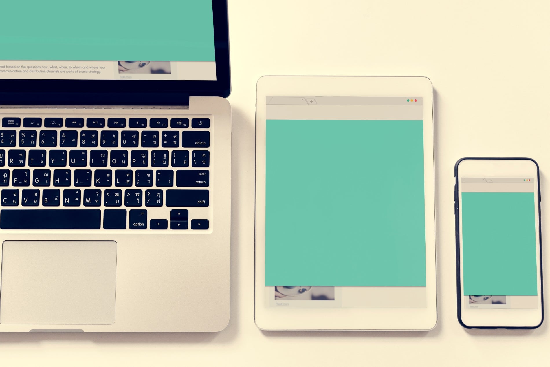
Responsive Web Design is about creating a website to provide an optimal user experience regardless of the device used to access it. The beauty lies in the fact that only one set of source code is required, regardless of how many ways the content will be displayed.
A reactively built site will pay attention to the size and resolution of the screen and resize and reposition elements on the page accordingly. The size of text and media will change gracefully to provide the best reading and viewing experience, and the behavior of navigation and menus will change to prioritize the most important content.
At Studi o Cassette We support you from the definition of your strategy to the creation of your site. With our clients we like to favor proximity, which is why we welcome you in our two agencies, located in Paris and Aix en Provence to guide and advise you in each stage of your project.
Do not hesitate to contact us contact so that we can discuss your needs.